Vix and volatility: To be anticipated
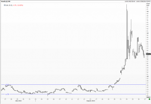
The S&P 500 index this year had held in the tiniest range in decades – 3.5 per cent either side of its opening level – then in August the beast turned nasty. Taking so many by surprise the Vix index, which measures expected volatility over the next 30 days, soared from the pedestrian 14 per cent we had all got used to. On the 20th it hit 19 per cent, 28 the very next day, soaring to a high at 53.29 per cent within the opening hour on Monday the 24th.
Media commentators, analysts, and pundits running around with breathless coverage and few sensible suggestions – really not terribly helpful. As technical analysts we are expected to forecast trends and moves. Could we have anticipated this month’s drama?
Yes, in several ways. First by pointing out where strong and pivotal support levels are; these were terribly obvious in both the S&P 500 and the FTSE 100 indices. Secondly by drawing in important trend lines, many of which had been supporting the indices since 2011 or 2008/2009. Thirdly by estimating where measured targets might lie so investors can try and gauge the cost potential sharp falls might have on their portfolios, and whether they could live and bear with the downside risk.
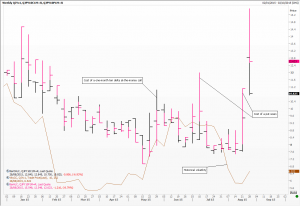
Other more subtle methods might be used. A careful monitoring of implied volatility is an obvious starting point. Look at the chart of the cost to buy either a put or a call on the dollar/yen exchange rate. The skew had been in the puts’ favour much of this year, meaning that more people were worried about a fall in the value of the US dollar against the Japanese unit. The cost of this insurance started soaring well before this week’s 5.5 yen clear-out in the spot market.
The average true range is another way of trying to spot an incremental increase in volatility. Introduced years ago by Welles Wilder it is a moving average (usually 14 days) of the larger of any of these three variables: daily high minus low; current high from previous close; current low from previous close. Measured as the minimum trading unit, it is simple to use and reflects price action quickly.
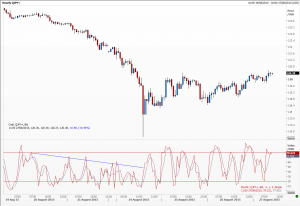
And finally I have been experimenting with the fast stochastic on intra-day data. I have no empirical evidence yet but I do notice that the switch between the 20 and 80 levels are faster and the turns sharper as volatility increases. Look at the hourly chart of dollar/yen and perhaps you can spot the shift that takes place as of 13:00 GMT Monday. I think I might add this to my armoury.
Tags: Japanese yen, stock indices, US dollar
The views and opinions expressed on the STA’s blog do not necessarily represent those of the Society of Technical Analysts (the “STA”), or of any officer, director or member of the STA. The STA makes no representations as to the accuracy, completeness, or reliability of any information on the blog or found by following any link on blog, and none of the STA, STA Administrative Services or any current or past executive board members are liable for any errors, omissions, or delays in this information or any losses, injuries, or damages arising from its display or use. None of the information on the STA’s blog constitutes investment advice.
Latest Posts
- Avoid Revenge Trading: The Key to Long-Term Trading Success March 31, 2025
- Mastering Relative Strength Portfolios: Key Takeaways from the March STA Meeting March 12, 2025
- Stay Disciplined, Stay Profitable February 26, 2025
- Understanding Price Gaps in Trending February 19, 2025
- Key Takeaways from a Fireside Chat with Perry Kaufman February 12, 2025


Latest Comments