That was the Week that Was: And then the client asks: ’’how are you left?’’
A phrase dreaded by market makers in all areas of finance who, because they are obliged to make two-way prices for existing clients throughout the business day, means there are more difficult orders on the way and the most recent price the client accepted was because it went in their favour. In other words, the dealer’s got stuck with a nasty position and scrambling out of it is about to get even harder.
The reason I’m thinking of this was because of the sharp and sudden equity index losses last week, extensively covered by the media. The usual hyperventilating excesses and the quest for cause and effect narratives, they’ve decided on to the economic effects of the coronavirus.
As technical analysts, we’d approach things differently, having been looking out for signs of instability in overbought markets. Then we’d have trigger points ready to adjust our trades, cutting or reversing open positions. This helps keep a lid on emotions and stifle panic attacks. Then we’d compare similar and related instruments, looking at percentage moves rather than points lost – especially important when measuring things that are priced in big numbers, like the Dow Jones Industrial Average, Nikkei and Italy’s MIB, and increasingly the price of certain bonds, many of which are trading well over parity.
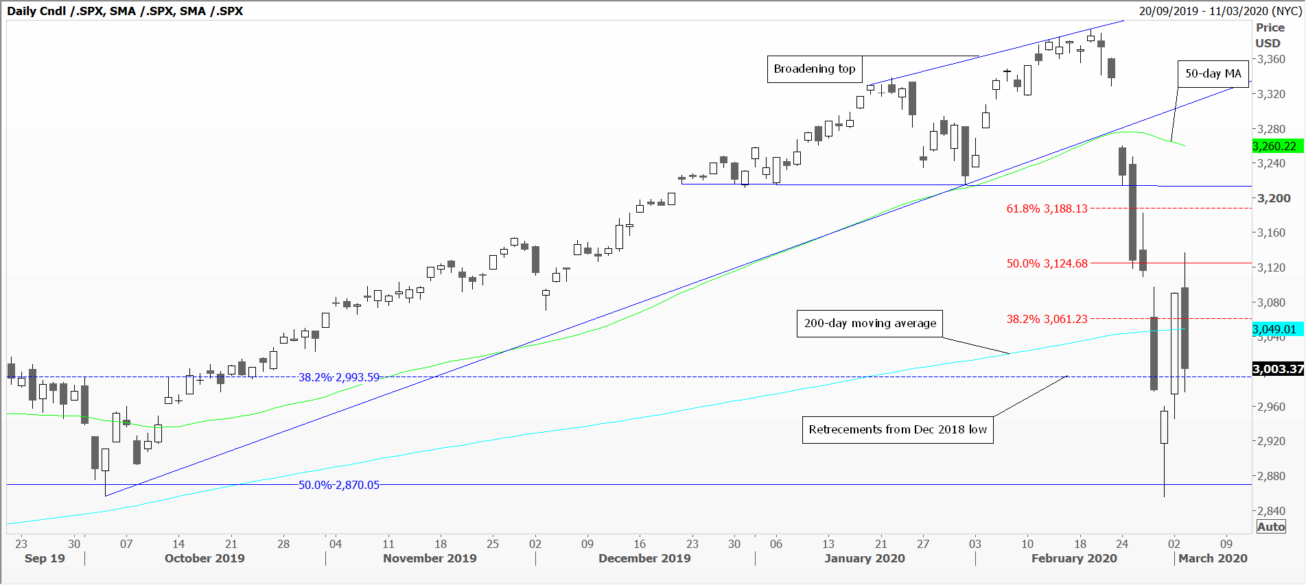
Look at the three candlestick charts attached. The daily one for the S&P 500 shows the reluctant rally in tiny moves this January to mid-February; I liken it to a funicular railway and you can almost feel the cog slipping. Gapping through trend line support and the 50-day moving average, then collapsing below the bottom of the broadening top. Slicing through the 200-day moving average with another gap, to retrace half of the rally since December 2018. Comprehensive.
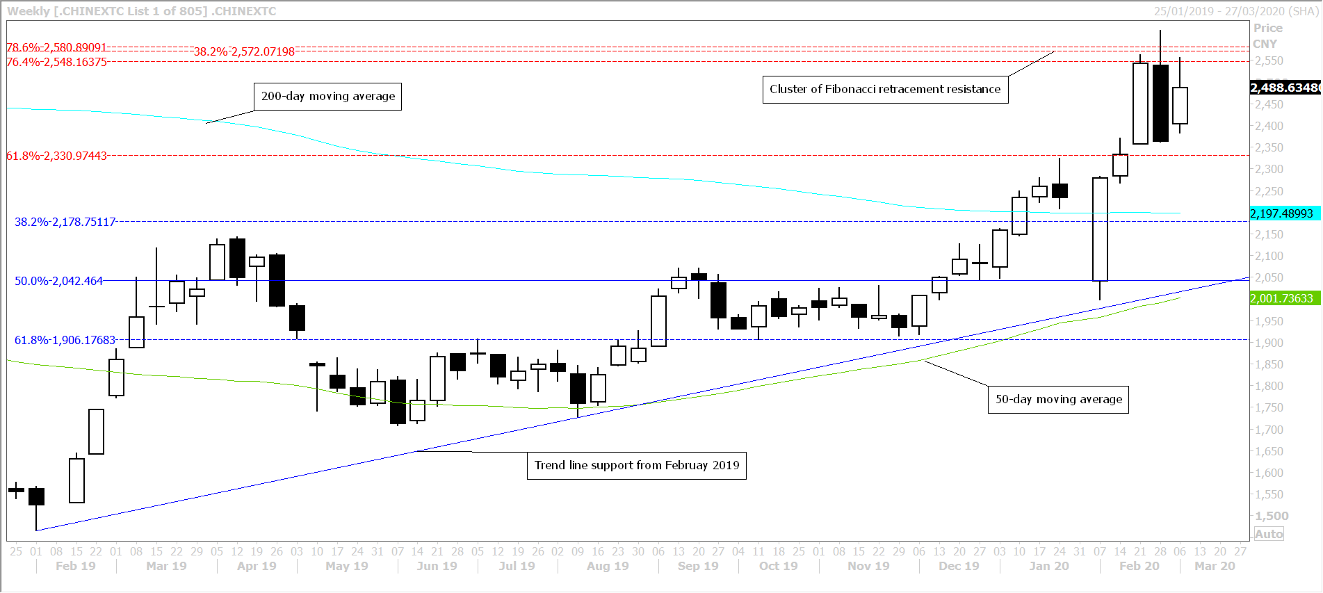
The second chart is that of China’s Nasdaq equivalent, the ChiNext, and a weekly chart – remembering the exchange was closed for the Lunar New Year holiday. On re-opening it had given up half of the rally of the last year, but promptly filled that gap within the week, then rallied the next fortnight. Not bad for an index at the centre of Covid-19.
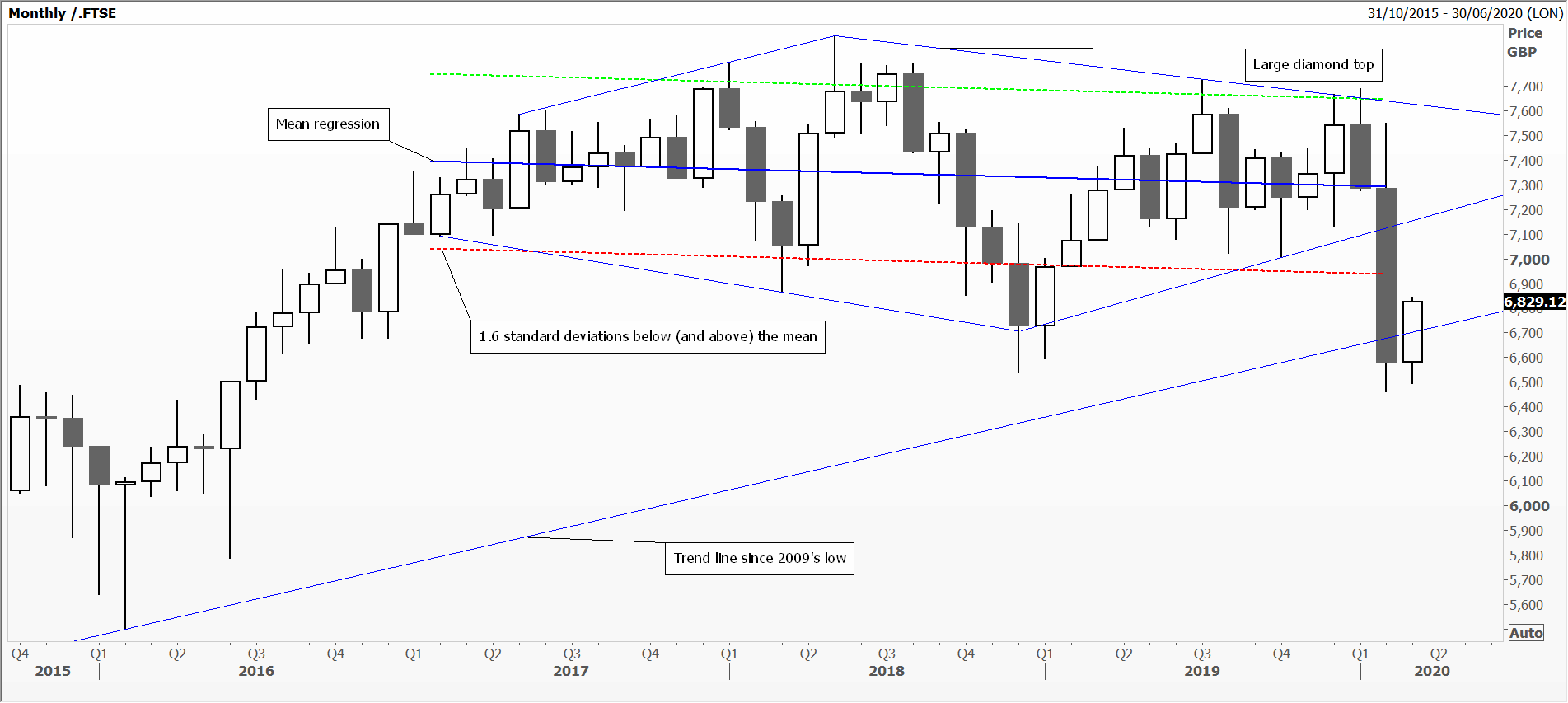
Finally a monthly chart of the FTSE 100, which opened February just below the mean regression, rallied up to nearly the top of the diamond pattern, and failed. Slipped dramatically below the bottom edge of the diamond and below 1.6 standard deviations from the mean, to settle below trend line support (from 2009’s low). Remember, this index has struggled to hold above the psychological 7000 since first getting there in December 1999.
Tags: Equities, percentage, Relative Performance, Start Point
The views and opinions expressed on the STA’s blog do not necessarily represent those of the Society of Technical Analysts (the “STA”), or of any officer, director or member of the STA. The STA makes no representations as to the accuracy, completeness, or reliability of any information on the blog or found by following any link on blog, and none of the STA, STA Administrative Services or any current or past executive board members are liable for any errors, omissions, or delays in this information or any losses, injuries, or damages arising from its display or use. None of the information on the STA’s blog constitutes investment advice.
Latest Posts
- Navigating the Market: Insights from Robin Griffiths and Ron William April 9, 2025
- Avoid Revenge Trading: The Key to Long-Term Trading Success March 31, 2025
- Mastering Relative Strength Portfolios: Key Takeaways from the March STA Meeting March 12, 2025
- Stay Disciplined, Stay Profitable February 26, 2025
- Understanding Price Gaps in Trending February 19, 2025


Latest Comments