‘And it’s a goal! Again’ Rectangles, corsets and straightjackets
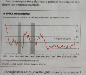
I’m not a proper football fan, but as scores and rankings come part and parcel with all news these days, I noticed that matches seemed to be managing a lot more goals than they used to. My attention was drawn to a chart last month in a FT Weekend Magazine article by Oliver Roeder illustrating, based on the extensive data held by psychology professor James Curley, the number of goals in English team games since 1888. (See chart 1).
When Roeder wrote: ‘’there was a dramatic goal spike in the 1920s that followed the loosening of the offside rule’’ I almost gave up. I didn’t though because what had really caught my eye was that for 50 years between 1970 and 2020, there had been an average of 2.6 goals per game. This was a formative period in my education and had thus created my bias towards how many goals to expect from your standard footie match. Subsequently the number of goals surged to 3.23 this year in the Premier League, by far the highest number in 60 years.
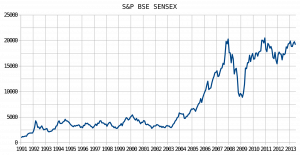
This reminded me of a particularly pushy journalist from the Hindustan Times of India who was always phoning me for bullish quotes on the Mumbai Sensex stock index (see chart 2).
One day he really got to me so, in my sternest voice, I said: ‘’Listen, this index has been stuck between 2500 and 5000 since 1992. When it breaks out of this surprisingly long rectangle, let me know and I’ll take a proper look’’. He did leave me alone until the year 2000, where my answer was that the recent move above 5000 looked unsustainable for all sorts of reasons. He was upset, but called again in 2003 when I suggested that we were witnessing a very significant breakout, gave him the story he wanted, and was then asked for an interview at New Delhi TV. Measured targets I gave were the height of the rectangle (2500 points), 1.618 times the same height, and the width of the rectangle – at which point the anchor gasped.
These are fairly standard measured targets from a market which has been constrained in a straightjacket, the longer the corset holds the more likely the next move will be violent. Something similar happened to Jakarta’s main stock index.
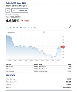
More recently we have seen a sharp move higher since 2022 in developed market government bond yields. Having crawled along at nothing or next to nothing since the financial crisis of 2008, most have roared higher shocking the younger generation who knew nothing other than a zero interest rate policy.  The third chart, of the benchmark UK 20-year Gilt yield, isn’t so neat but does exhibit long stretches of moves contained in a rectangle.
Tags: Breakouts, range trading, Rectangles
The views and opinions expressed on the STA’s blog do not necessarily represent those of the Society of Technical Analysts (the “STA”), or of any officer, director or member of the STA. The STA makes no representations as to the accuracy, completeness, or reliability of any information on the blog or found by following any link on blog, and none of the STA, STA Administrative Services or any current or past executive board members are liable for any errors, omissions, or delays in this information or any losses, injuries, or damages arising from its display or use. None of the information on the STA’s blog constitutes investment advice.
Latest Posts
- Navigating the Market: Insights from Robin Griffiths and Ron William April 9, 2025
- Avoid Revenge Trading: The Key to Long-Term Trading Success March 31, 2025
- Mastering Relative Strength Portfolios: Key Takeaways from the March STA Meeting March 12, 2025
- Stay Disciplined, Stay Profitable February 26, 2025
- Understanding Price Gaps in Trending February 19, 2025


Latest Comments