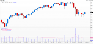
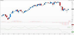
Are histograms of any use? To technical analysts, of course
Primary school first introduced us to basic charts, cutting up a pie into equal-sized portions to feed all those around the table, plotting the height of class members as a histogram, or a line linking the number of hours’ worth of television viewing per child. Later moving on to Venn diagrams and normal distributions, charts have been with us all our lives.
As professional technical analysts we were introduced to a whole new level of whizz-bang charting of ever greater complexity and dazzling display. The beguiling beauty of some of these; the stunning array of colour schemes; the need to describe things in a foreign language and specialist terminology; all are testament to the analyst’s top class knowledge and erudition – not forgetting his or her superior skill implied by the use of these.
Yet still we fall back to some of the simplest methods to describe key elements in our analysis. Ever since I can remember volume is plotted as a histogram, often with open interest as line overlay. Oscillators of all types are usually drawn as lines and both of these features are placed more often than not below the chart of price action itself. Oscillators are particularly useful to watch for signs of divergence from price once a market is trending as these can be used as an indication that the trend may be waning. http://www.investopedia.com/articles/trading/08/price-momentum.asp
Market profile turns the histogram on its side and in a way links statistical bell curves with market price action. I personally find a histogram of the MACD infinitely easier to use than the two lines themselves, though I cannot imagine using this in a moving average crossover method. Using the MACD as a histogram makes it very clear when it is above or below the zero line. Above the zero line suggests the underlying trend remains bullish, below and the underlying trend is deemed bearish. Implied volatility at any point in time can be plotted as a histogram, with at-the-money at the centre and increasingly deep out of the money puts to the left and calls to the right.
Finally, in a bid to eradicate ‘noise’ some technical analysts I know fall back on the crudest form of line chart. Spikes and traps are avoided – and a whole lot of granularity sacrificed – in order to try and distil the true essence of price action. This can be especially useful in thinly traded instruments and truly hectic market conditions. It also requires nerves of steel from the trader.
Charts Reuters
Tags: MACD, open interest, volume
The views and opinions expressed on the STA’s blog do not necessarily represent those of the Society of Technical Analysts (the “STA”), or of any officer, director or member of the STA. The STA makes no representations as to the accuracy, completeness, or reliability of any information on the blog or found by following any link on blog, and none of the STA, STA Administrative Services or any current or past executive board members are liable for any errors, omissions, or delays in this information or any losses, injuries, or damages arising from its display or use. None of the information on the STA’s blog constitutes investment advice.
Latest Posts
- Trade with a Plan: The Key to Consistent Success October 28, 2025
- Trust Me, I’m a Technical Analyst by Trevor Neil: Why Charting Is as Important Now as Ever October 15, 2025
- Why Networking Still Matters: Reflections from the STA Drinks at the National Liberal Club October 2, 2025
- Fireside Wisdom: Clive Lambert in Conversation with Tony LaPorta September 10, 2025
- Understanding Triple RSI Divergence: A Potential Warning Sign for the S&P 500 September 1, 2025


Latest Comments