Charts were not made equal: Some are more useful than others
As a technical analyst you are au fait with bars, candles, and point and figure graphs. Some might add Renko and Kagi – and did you know that Karagi charts plot precipitation and temperature? I’m sure there’ll be other styles few of us have even heard of.
Line graphs and histograms are an economist’s basic tool, even if they claim to favour data in tables, as being visual they are so much quicker to use. The media like them too because they are much more powerful than lists and text, because ‘a picture’s worth a thousand words’ and all that. Info graphics is a rapidly expanding are of publishing.
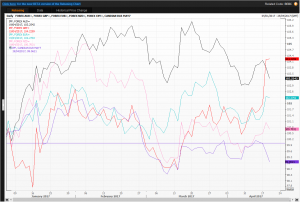
But one type of chart I’ve increasingly been using is a line chart that rebases data to an equal point on a specific day. In this way one compares percentage, not absolute moves, of a chosen set of instruments. Look at the first example: five currencies quoted as number of US dollars and cents per currency unit. Australian, New Zealand and Canadian dollars (quoted the North American way round), plus euro and sterling. All start in January this year at the 100 nominal level. The latter put on a spurt this week so that it has gained more than the rest, up 4.22 per cent in relative value this year. It helped both the euro and Kiwi higher, thought not so the other two where the Canadian dollar has lost about 1 per cent of its value against its southern counterpart.
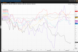
Now look at the second chart, where Asian currencies are quoted as units of currency needed to buy one US dollar. You will see that the South Korean won was getting stronger more quickly than the others, at one point almost 9 per cent evaluation since January versus the greenback – until Pyongyang and its missiles reversed the move. The Japanese yen’s trajectory has been far smoother, currently at about 108.75 yen per US dollar and 7 per cent stronger so far in 2017.
I’m sure you’re getting my drift and seeing that these rebasing charts are great when comparing groups of share and commodity prices, indices more generally, and even house prices.
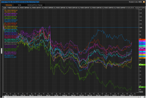
The third chart (with a black background which I usually tend to avoid in text material) shows just how much the pound has weakened this year against many other major currencies. Holding up best against the Polish zloty, Norwegian and Swedish krone where its lost roughly 8 per cent, against a very significant 21 per cent to the yen, the star turn is the Russian rouble which has gained a whopping 38 per cent. The oligarchs will be looking forward to spending the season in Mayfairski, Londongrad!
Tags: percentage, ratio, rebasing, relative
The views and opinions expressed on the STA’s blog do not necessarily represent those of the Society of Technical Analysts (the “STA”), or of any officer, director or member of the STA. The STA makes no representations as to the accuracy, completeness, or reliability of any information on the blog or found by following any link on blog, and none of the STA, STA Administrative Services or any current or past executive board members are liable for any errors, omissions, or delays in this information or any losses, injuries, or damages arising from its display or use. None of the information on the STA’s blog constitutes investment advice.
Latest Posts
- Navigating the Market: Insights from Robin Griffiths and Ron William April 9, 2025
- Avoid Revenge Trading: The Key to Long-Term Trading Success March 31, 2025
- Mastering Relative Strength Portfolios: Key Takeaways from the March STA Meeting March 12, 2025
- Stay Disciplined, Stay Profitable February 26, 2025
- Understanding Price Gaps in Trending February 19, 2025


Latest Comments