Colours, clashes and clichés: How and why use colourful charts
Plowden & Smith are an expert art and antiques conservation business in south London who I follow on LinkedIn. Tackling projects great and small, their level of expertise and willingness to share some of it is refreshing. Very recently they published a video piece on colour theory where Hugo Nathan, of art advisory firm Beaumont Nathan, picks a series of works on the subject for a fantasy exhibition he is curating.
What’s all this got to do with technical analysis, you ask. Because colour, and colour combinations, really do matter. How long have many new home owners spent agonising over dabs of paint and swatches of fabric. Yet rarely do we put as much time and thought into our chart’s colours. Too often we just stick with the default setting.
Originally this was charcoal on white graph paper, sometimes pale green squares – often used in fractional rather than decimal divisions. Always using pencil, where mistakes can be rubbed out, though some brave souls used ultra-fine black marker pens for added definition. Candlesticks like three white knights and three black crows only make sense in this colourway.
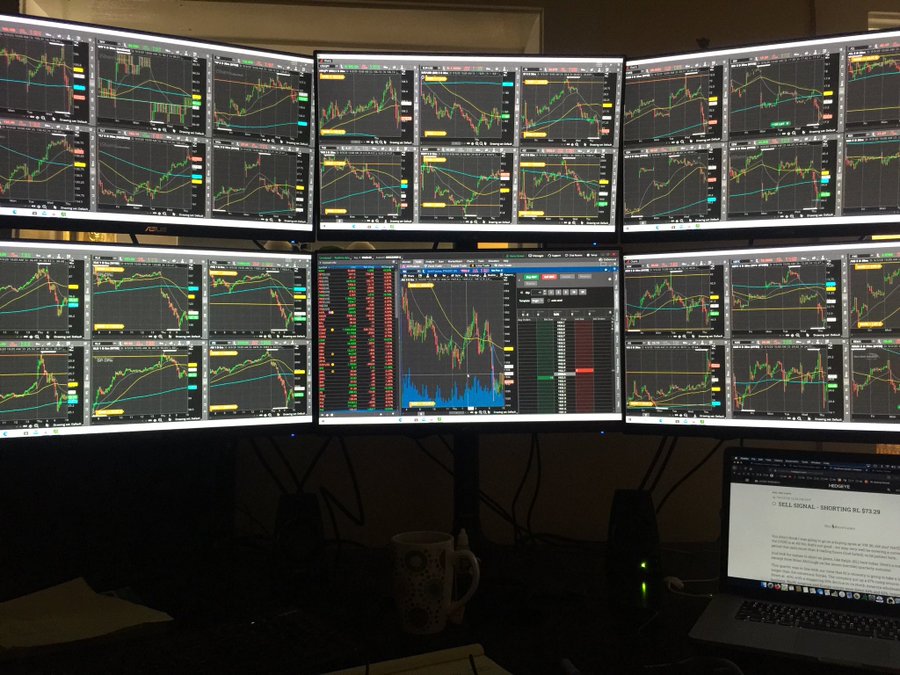
The first chart packages tended to follow the style of news vendors like Reuters and Bloomberg, with green or orange font/lines on a black background. Tiring on the eyes – there is a reason why print text is black on white – and terrible for the environment when printing on paper as so much ink is used.
Bar charts can only be in black (on white), or a bright colour on black; line charts will have as many colours as you need to differentiate each series of data. When stock brokers took to candlestick charts they insisted that up-days must be green and down-days red. Trouble is, in China red is an auspicious colour and they do things the other way round, red reserved for rallies.
I’ve often incorporated the company’s colours into my charts, just as other promotional material will stick to logos, fonts and colour schemes approved by the marketing department. Swiss bank UBS sticks to red, white and black (competing with HSBC along the way); navy and red are another popular choice.
Reuters Eikon used to have a series of pre-set colour combinations which were intended as thematic choices. With names like ‘jazzy’, ‘patchwork’ and several more, as each analytical feature was added it would follow a set series of colours intended to create a harmonious picture. ‘Patchwork’ was syrupy and grim.
Needless to say, the art expert has a lot more to say on the subject.
Tags: confidence, Hard Data, Opinion Surveys, Survey Data
The views and opinions expressed on the STA’s blog do not necessarily represent those of the Society of Technical Analysts (the “STA”), or of any officer, director or member of the STA. The STA makes no representations as to the accuracy, completeness, or reliability of any information on the blog or found by following any link on blog, and none of the STA, STA Administrative Services or any current or past executive board members are liable for any errors, omissions, or delays in this information or any losses, injuries, or damages arising from its display or use. None of the information on the STA’s blog constitutes investment advice.
Latest Posts
- Navigating the Market: Insights from Robin Griffiths and Ron William April 9, 2025
- Avoid Revenge Trading: The Key to Long-Term Trading Success March 31, 2025
- Mastering Relative Strength Portfolios: Key Takeaways from the March STA Meeting March 12, 2025
- Stay Disciplined, Stay Profitable February 26, 2025
- Understanding Price Gaps in Trending February 19, 2025


Latest Comments