


Confidence and the Corona Virus: What are consumers to make of it all?
The word ‘confidence’ has been bandied about a lot of late; more specifically, prefaced by ‘lack of’. Currently centre stage in Britain is the Secretary of State for Education, the Rt Hon Gavin Williamson CBE. He is merely one among many, with ‘The Science’ and its 4 Chief Medical Officers (earning on average £259,000), Public Health England (which has had to be disbanded), and the judiciary too – just for good measure.
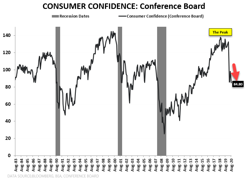
Measuring consumer confidence is tricky because people often don’t do what they say. Take recent retail spending in the UK and US. This has recovered by more than expected over the summer, yet official measures remain downbeat in both nations. Possibly because sensible adults already have an inkling as to what might happen after government support schemes end. US Conference Board data shown in the 2 charts attached show the precipitous decline this year – mind you, akin to that over the Millennium. Nothing new under the sun then.
As technical analysts we too use a mix between what some people call ‘hard data’ and ‘soft data’. If economists watch Gross Domestic Product, house prices and business investment data – tangible statistics – they also use Purchasing Managers’ Surveys, business outlooks and investment intentions – surveys of opinion. Likewise with our charts, key and totally plottable is price. But then so too are volume and open interest, oscillators like momentum and relative strength, plus bog standard moving averages.
Other oscillators are used by some but not all, such as stochastics and parabolic stop-and-reverse – this list could go on and on – suggesting that a degree of subjectivity has already crept in. Perhaps the most obvious and extreme example of the mix between price data and subjectivity is implied volatility. VIX, the well-known index of expected volatility in S&P 500 options, springs to mind, but remember that its pricing is asymmetric as too many are hedging against a drop in the US stock market.
Optionality in FX options is perhaps more evenly balanced, but here too trends emerge and entrenched ideas can take hold for months and years on end – as displayed by the higher cost of either puts or calls. My third chart is of the implied volatility of puts and calls, as compared to historical volatility (the line chart). The implied measures the cost (priced in percentages) of at-the-money volatility on 10 delta, one month options – in this case for the euro against the US dollar.
It’s up to you how much weight you give to one or the other.
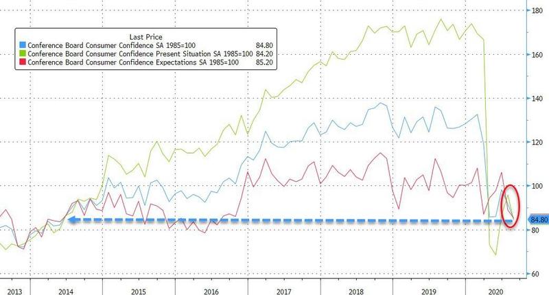
US consumer confidence
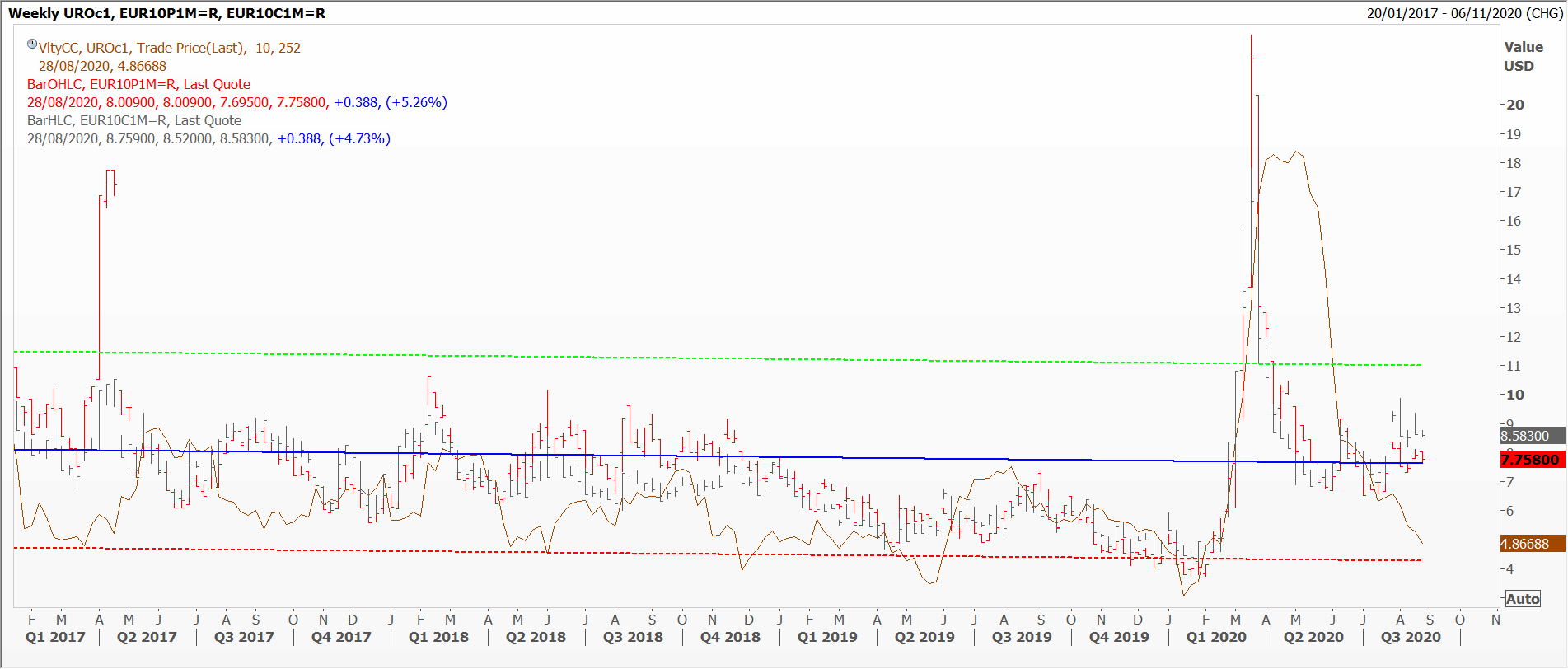
EURvol
Tags: confidence, Hard Data, Opinion Surveys, Survey Data
The views and opinions expressed on the STA’s blog do not necessarily represent those of the Society of Technical Analysts (the “STA”), or of any officer, director or member of the STA. The STA makes no representations as to the accuracy, completeness, or reliability of any information on the blog or found by following any link on blog, and none of the STA, STA Administrative Services or any current or past executive board members are liable for any errors, omissions, or delays in this information or any losses, injuries, or damages arising from its display or use. None of the information on the STA’s blog constitutes investment advice.


Latest Comments