Payback time for QE looms: And it will be pricey
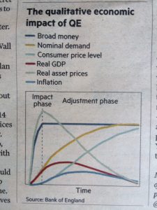
So wrote Merryn Somerset Webb in her Investing column in the FT Money section of the latest Weekend Financial Times. I attach the chart she used for the article, and am tempted to change the title of my piece to: How not to Chart. First, dear reader, take a close look at the chart which I photographed from the newspaper. Before going on to read the rest of this blog, I would urge you to take pen to paper and note what you think of the graphic. Please, take your time and look at the detail.
 Even though it may not be clear in my image, you will know that the background will be salmon-pink coloured. A newspaper which prides itself on being a top-notch, internationally renown resource of reliable information; a specialist financial publication helping investors and businesses make important decisions. This is their thinking and tone, not mine.
The source of the chart is the Bank of England, one that most would hope is reliable – but don’t take my word for it as we have found that the Office for National Statistics is prone to big revisions, the Office for Budget Responsibility likewise restating its forecasts, and economists generally living in optimistic Goldilocks land.
So, to the chart. Note the complete absence of scales on both axes. Maybe a mistake but one that subeditors, editors and printers should have spotted a mile away. Then we have the vertical dashed line; what is this? When and why? The most recent data points, are they today?
The broad money line, if the dotted line was the end of QE, suggests that money supply growth has been completely flat; this is not the case. It has been increasing, albeit too slowly for many over the last 5 years or more. The yellow line, nominal demand: for what? Possibly financial assets, or maybe property. Who knows; labelling very poor. The Consumer Price Level, and I’m assuming CPI, peaked a few months ago and is now edging slowly lower, something the chart does not show. Real GDP is/has sagged – over how long since peaking; are we talking Great Financial Crisis and 2009? Perhaps this a projected rate of change. Just exactly what are ‘real asset prices’? They certainly have been a real rollercoaster and I bet it’s unlikely that it’s food. Inflation, I would suggest, has been more volatile than GDP, so why then does this have the flattest trajectory?
So very perplexing, and disappointing.
I hope you will have access to the full story via this link:
www.ft.com/content/8e131f28-431c-11e8-803a-295c97e6fd0b
Tags: Assets, bonds, Payback, Quantative Easing
The views and opinions expressed on the STA’s blog do not necessarily represent those of the Society of Technical Analysts (the “STA”), or of any officer, director or member of the STA. The STA makes no representations as to the accuracy, completeness, or reliability of any information on the blog or found by following any link on blog, and none of the STA, STA Administrative Services or any current or past executive board members are liable for any errors, omissions, or delays in this information or any losses, injuries, or damages arising from its display or use. None of the information on the STA’s blog constitutes investment advice.
Latest Posts
- Mastering Relative Strength Portfolios: Key Takeaways from the March STA Meeting March 12, 2025
- Stay Disciplined, Stay Profitable February 26, 2025
- Understanding Price Gaps in Trending February 19, 2025
- Key Takeaways from a Fireside Chat with Perry Kaufman February 12, 2025
- The Power of Patience: How Waiting for the Right Setups Can Make or Break Your Trading Success February 3, 2025


Latest Comments